Pour PLanning Brand
Pour Planning is a brand-new mobile bar based in Clayton, North Carolina. Situated between Research Triangle and a big wedding market in Johnston County, it’s the perfect spot for drinks on demand, served up in a very cute remodeled horse trailer. I worked with owner Jordan to brand her company and build out a suite of collateral. The event market is crowded and overwhelming, and brides and grooms and CEO’s have enough going on — we wanted Pour Planning to feel like the easy part. Everything in Pour Planning is meant to feel warm, welcoming, lived-in, and fun. Nothing snooty or formal here! I also created a tagline that gets that point across — it’s meant for good people having a good time. Pour Planning is here to pour cold drinks for warm hearts.
Scope
Brand Development • Logo Design • Visual Identity • Messaging • Illustration • Print Collateral • Social Media Design • Squarespace Web Design
color & typography
Pour Planning’s target audience is both weddings and corporate clients. (Can you imagine a mobile bar happy hour outside your office? A dream.) They need to be able to hang in the crowded wedding industry, but skewing overly flowery could alienate the corporate clients. We struck that balance with a rich and balanced color scheme, anchored by a dark teal and peachy pink with bright orange accents to keep things spicy. The typography feels fun and friendly, with a casual script accent font that gives a little vintage vibe.
Menus
Small tabletop menus were designed to be placed at guest seats and around the event. The colors on the front can easily be tweaked to match a different color scheme for those more particular hosts. The back remains Pour Planning branded as a leave behind for guests.
A large standing menu was designed to be placed outside the trailer for easy guest ordering. It can be hard to remember what you want on the walk from your seat to the trailer if it’s not your first trip.
Both menus templates were recreated in Canva for easy editing.
Website
Pour Planning’s website needed to be fun and welcoming from the get-go. The homepage is interesting and dynamic, but also gets you all the info you need right up top. Designing it in Squarespace makes it easy for Pour Planning to update themselves or for me to jump in and make more substantial changes.
Instagram templates
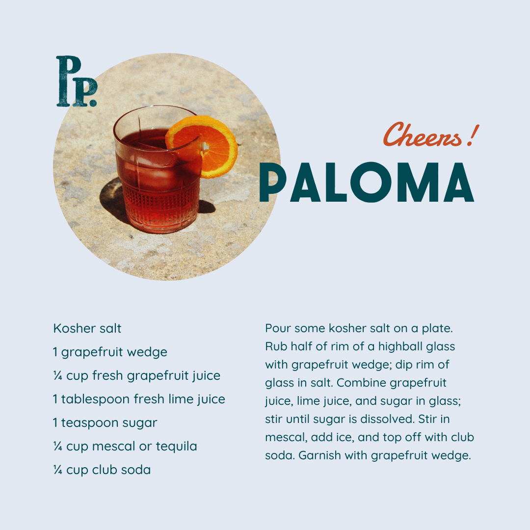
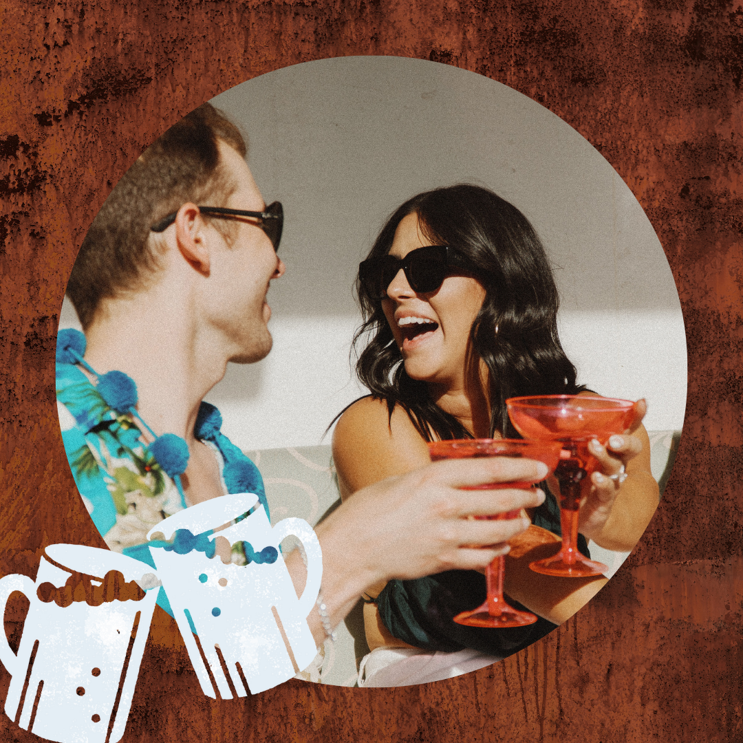
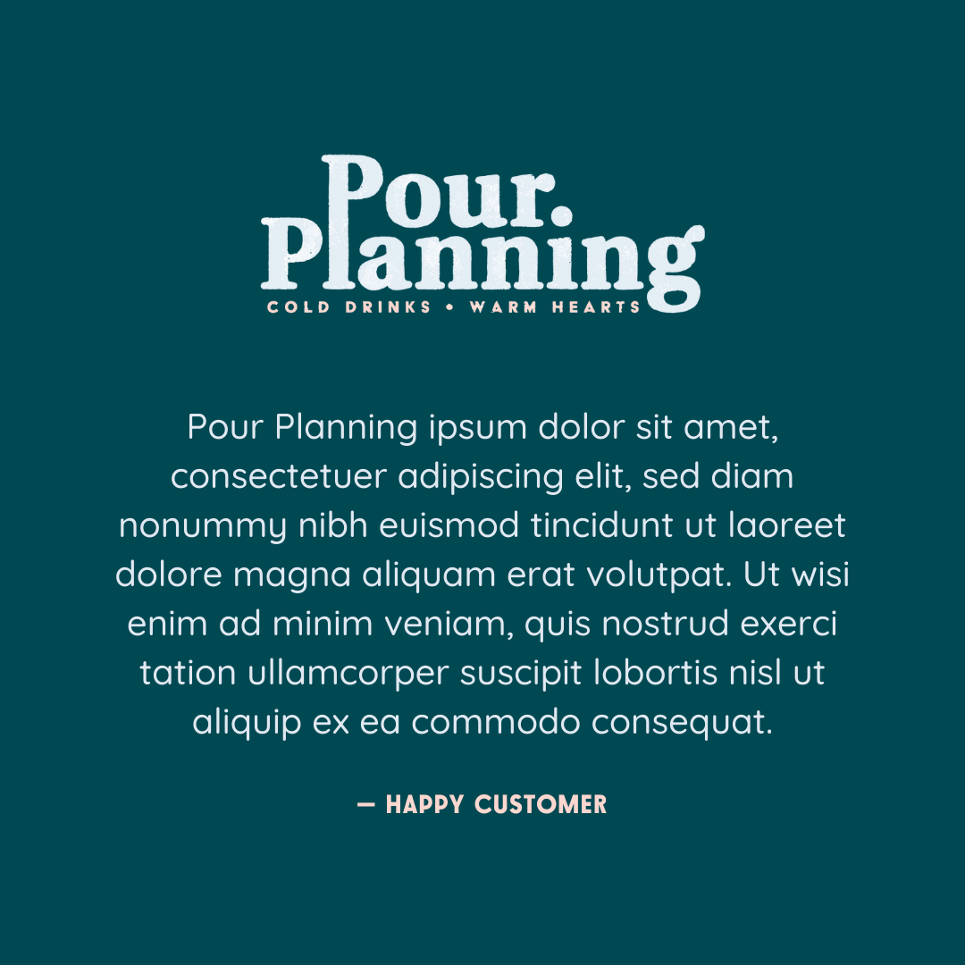
Both the bar and wedding vendor markets are crowded on Instagram, so Pour Planning needed templates that stood out and looked like them. Mixed with real event photos, their posts would be fun, varied, and useful. Sharing cocktail recipes is always a good way to make friends.
These templates were recreated in Canva for easy editing and posting.
Initial Concepts
We were going for a very particular vibe for this brand, that felt classic and cool and casual. Our moodboard notes actually contained the note “Feels like a weirdly delicious roadside burger stand you'd come across while driving a vintage convertible down Route 66.” That could go a couple different ways though, and our first-round concepts ran the gamut. All three included a bunch of submarks to keep the brand feeling fresh and fun across a ton of different collateral.
As you can see, other than mixing and matching some taglines and illustrations, we just about nailed it on the first round.
