Mid-America Real Estate Brand Guide
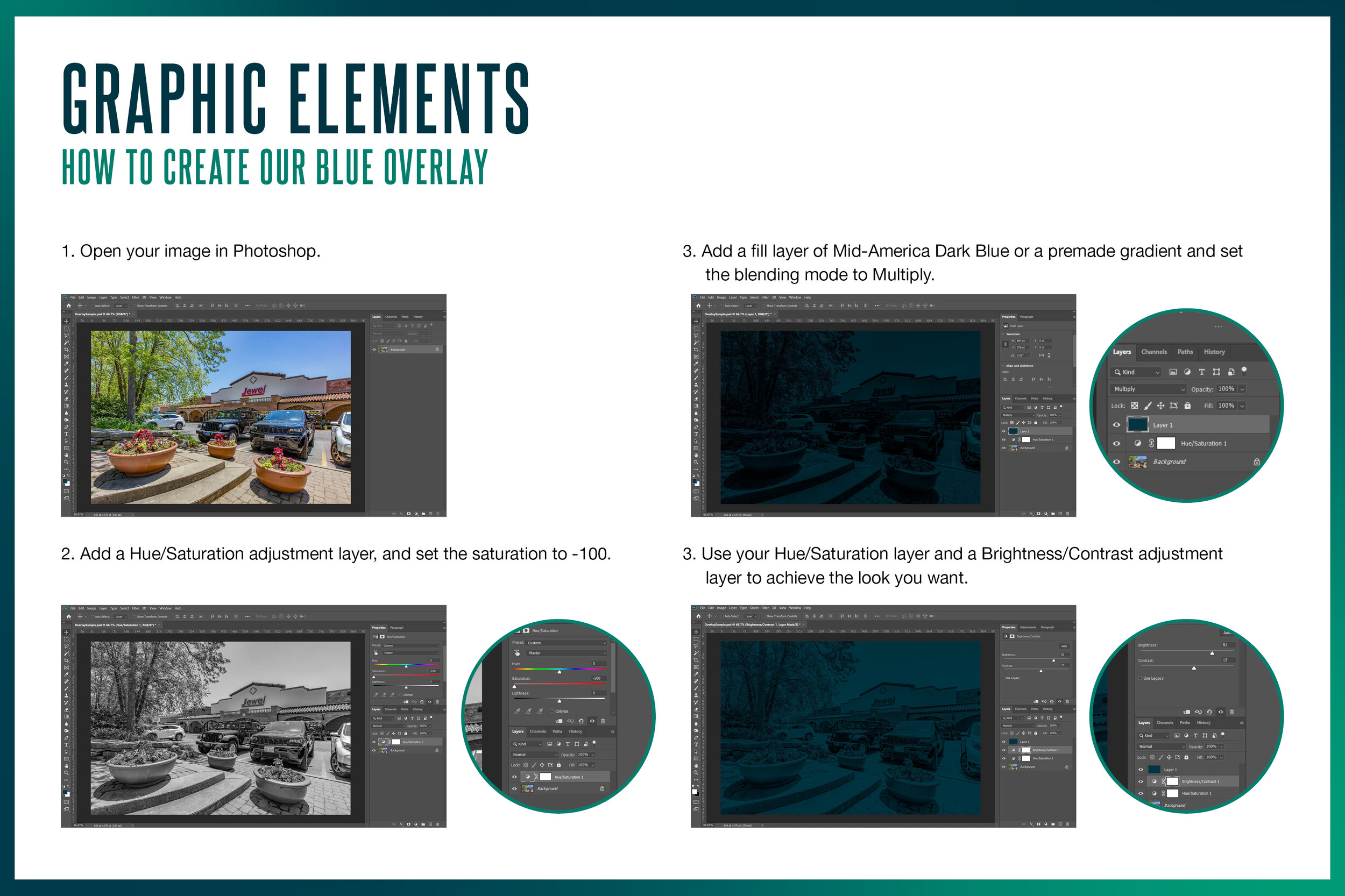
Mid-America Real Estate needed a clear-cut brand guide that would take the guess work out of their brand — something that can be handed to anyone and they can return something that looks and sounds like Mid-America. Building on their existing brand, I added an accent color to their color palette and new graphic elements like an overlay and gradients. The guide includes straightforward rules on things like photography, copywriting, and logo usage with visual examples and some tl;dr summaries.
Scope
Brand Development
Visual Identity
Messaging
Social Media Strategy


